“six feet apart”
An interactive installation built with MadMapper, Processing, Arduino, and found objects
Overview
“Six Feet Apart” explores the chaotic, connective, and life-altering effects of the COVID-19 pandemic.
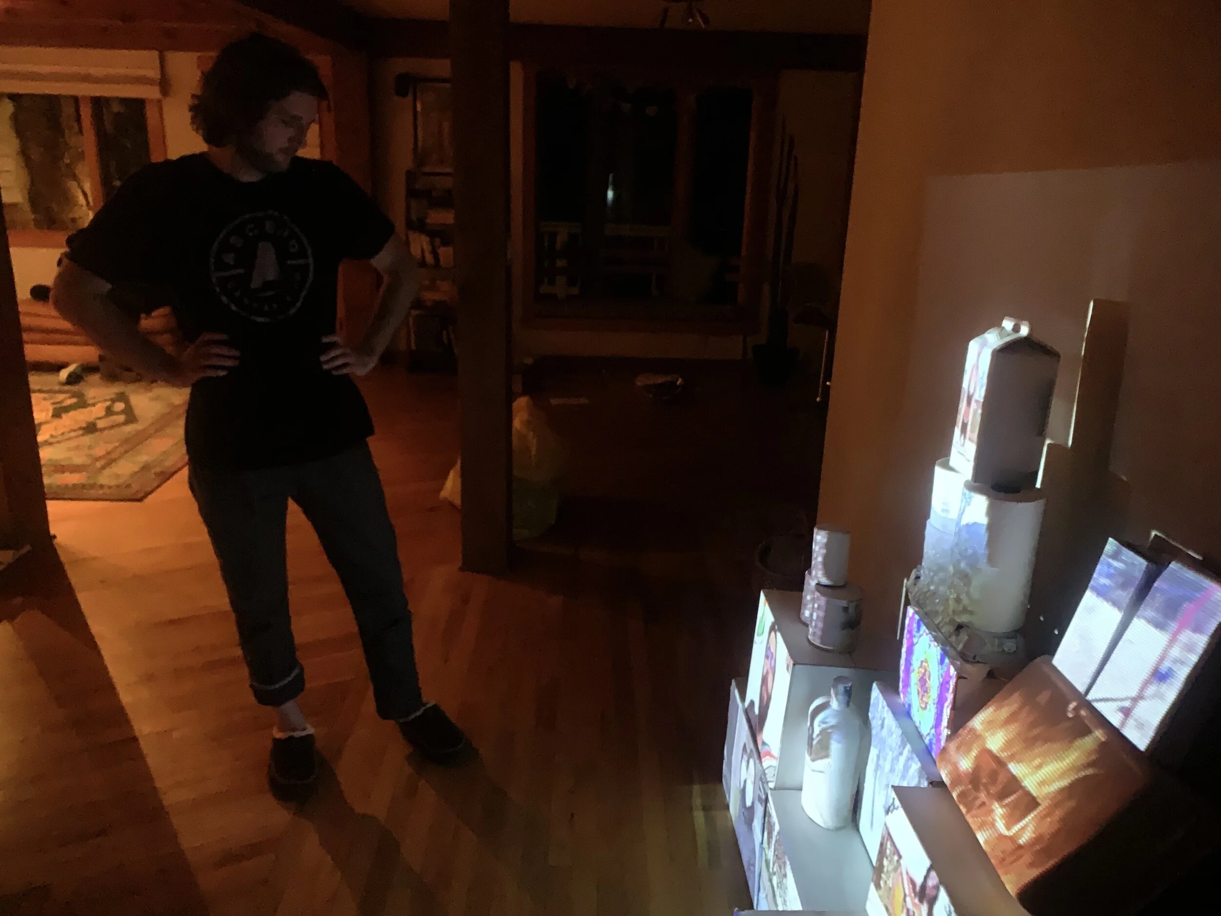
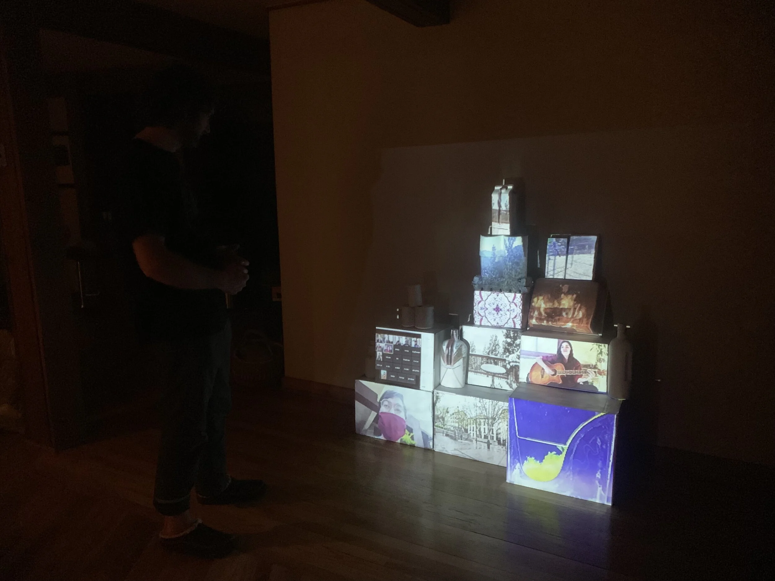
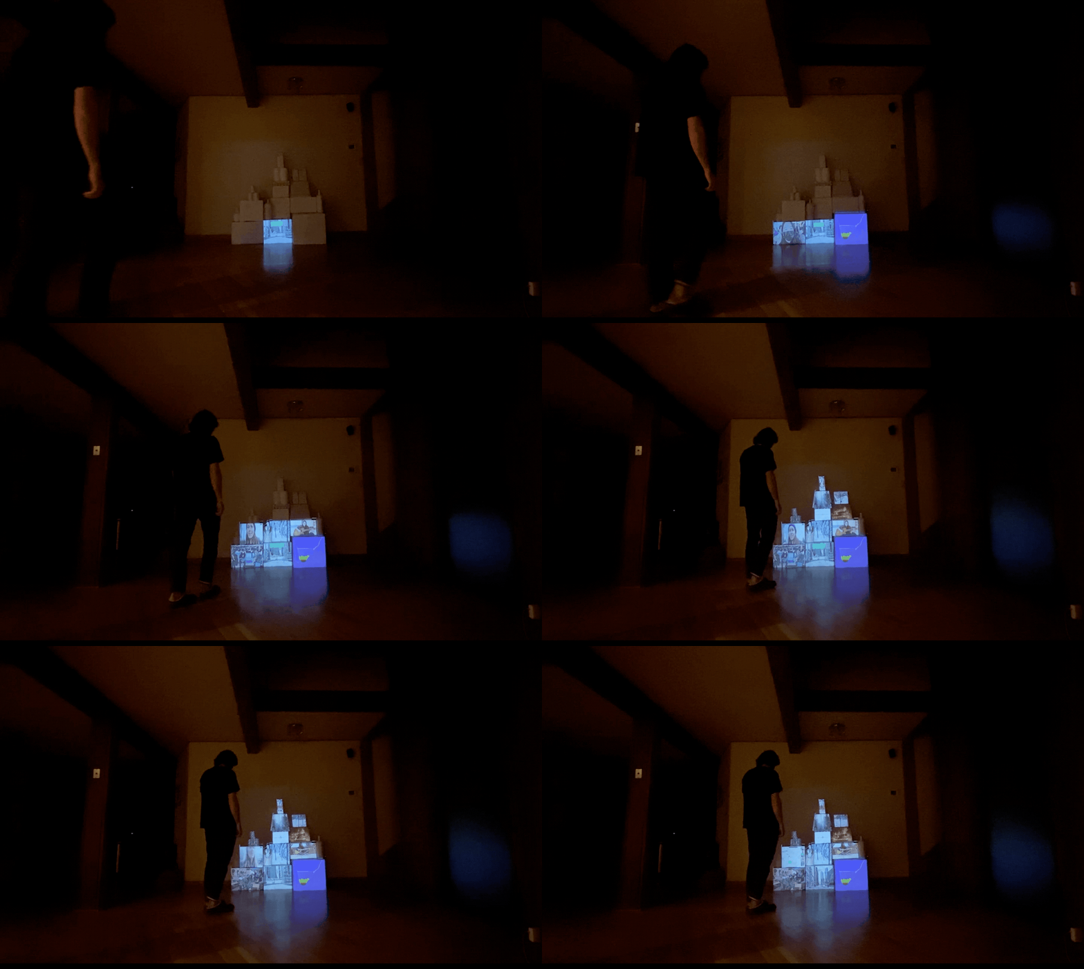
The sculpture, constructed of spray-painted remnants of time spent in isolation during mandated social distancing, lights up with projection-mapped video when the viewer approaches. Using an ultrasonic sensor, paired with coding through Processing, Syphon, and MadMapper, I was able to create an interactive installation that responds to a viewer’s proximity. As the viewer approaches, the sculpture fills with projection-mapped video imagery, building from the bottom, until the viewer is six feet away. At six feet away (the mandated social distancing requirement during this pandemic), the sculpture fully lights up all the way to the top. In this way, the installation itself becomes an active player in the user’s experience.
The footage that is being projection-mapped explores themes from my own perspective of quarantine, social isolation, and the wider scope of a global pandemic. I filmed and created time-lapses of myself doing yoga, meditating, playing guitar, speaking with friends, classmates, and family through Zoom, the snow falling and melting around my house, and empty streets and people wearing masks around the world. In this way, I hope to document and preserve a unique and crucial period of our lives. COVID-19 has been both a horrifying reality, as well as an opportunity to delve inwards and rediscover that which is most important in life — our relationships with ourselves, our loved ones, and our shared humanity.
What originally began as a semester-long, group project focused on creating an interactive, space-themed video game installation, necessarily became a solo project when quarantine started during the Coronavirus Pandemic. As the lead UX/UI Designer, Brand Designer, and Project Lead, I faced a particularly difficult and emotional hurdle when confronted with the reality that my group’s work throughout the semester would need to be altered both in terms of physical construction as well as concept.
While I was disappointed in the inefficacy of producing our original concept, I believe the final product exhibits strong consideration for both the theoretical user as well as the reality of social distancing. I did not end up with the installation we had dreamed and worked towards. However, my final project embraces key elements of our group project while adapting to our current reality. I kept the original elements of a mechanical sensor input (although rather than piezoelectric “buttons,” I use a proximity sensor) that runs signals through Processing, Syphon, and MadMapper consecutively. I also kept our original idea of a wall of “discarded electronics” to projection-map videos onto, and instead turned my wall into a sort of an ode to COVID, with delivery boxes, milk cartons, alcohol bottles, egg cartons, toilet paper, and empty cans.
Through “Six Feet Apart,” I hope to speak to our shared human condition, and provide a sense of both the negative and positive effects of a time in which our world was dangling, frozen in time and six feet apart.
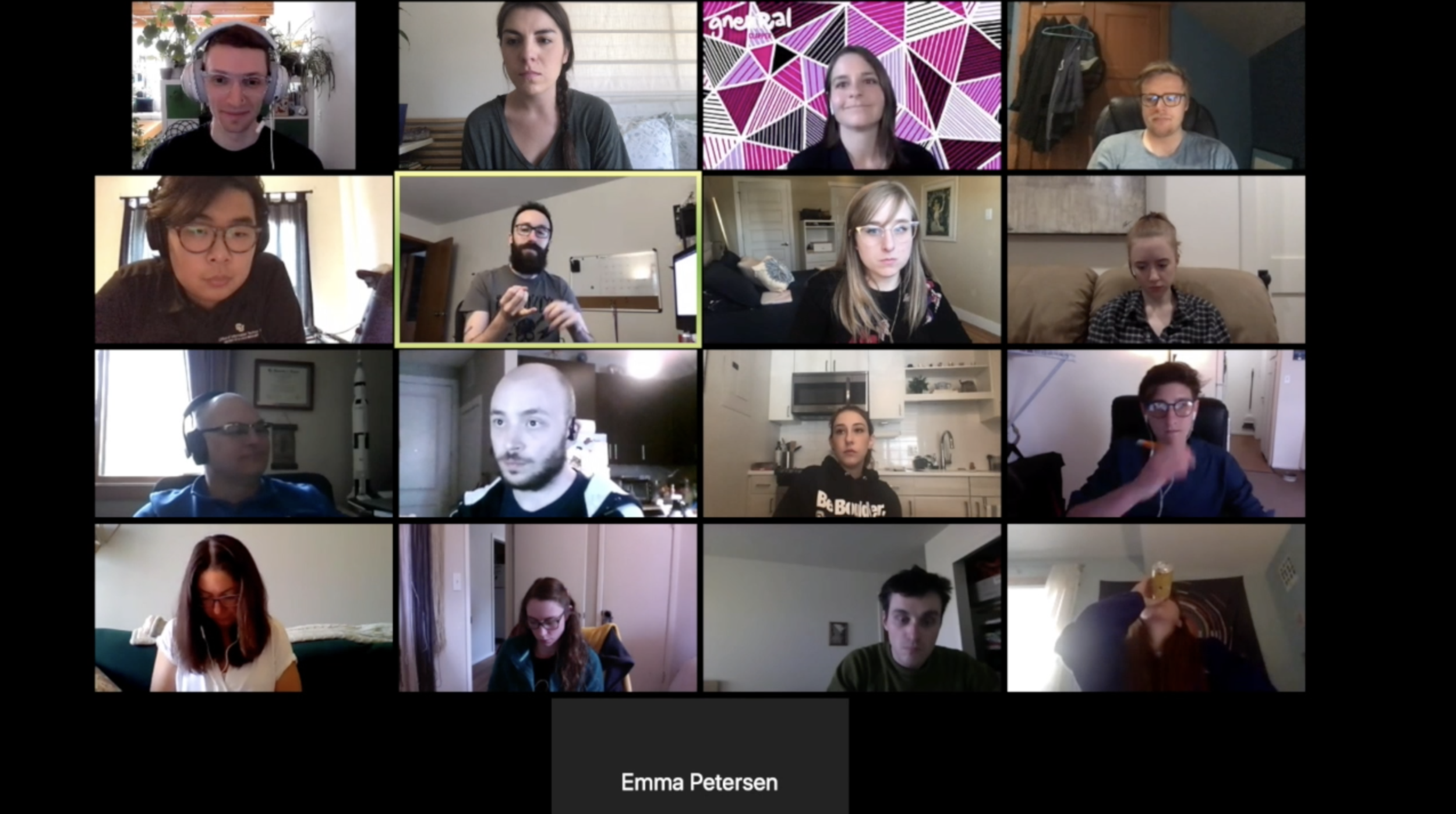
“The class set out to create human moments, and your solution cleverly addressed that, especially given our unforeseen new reality. The final product speaks directly to the challenges that you faced as the creator - this is called “authenticity” in the biz.”
Brand design
The brand name “Creative Connective” originated with simple idea of technology bringing people together — rather than isolating them. As the Lead Brand Designer, I liked the idea of playing upon the idea of a “collective” and calling ourselves a “connective.” One implies monetization while the other implies connectivity — a phenomenon that’s sadly lacking in our hyper-connected world.
I was inspired by circuitry design — a key component of our design concept — as well as playing off of other familiar logos (the likes of which I won’t list here for legal reasons). I also wanted to incorporate a sleek black and white design, with a touch of turquoise blue to signify circuitry boards. Not only is turquoise one of the most popular colors of 2019/2020, but I view it as a connection between the natural world and the electronic world.
Blue, while one of the hardest colors to reproduce (see the history of blue dying techniques), is also one of the most common colors in the natural world. Navajo culture believes that turquoise is a piece of the heavens fallen to earth. How far removed is this from that blinking light on your modem? Blue is easy to identify and difficult to recreate without the use of technology. Perhaps that is why blue has become a signifier for all things removed from the natural world — think cornflower blue ties, the blue light we filter from our screens so we can maintain proper melatonin production, and the blue (or green) lights that indicate an electronic equipment is functional. Blue surrounds us, both in the natural world, and in our daily lives — especially while we are confined to our homes and forced to engage more and more with technology.
I chose to keep the brand imagery and concept for my final project design both because it was my original concept and because I believe it perfectly encapsulates my final product. While I haven’t seen more than two people IRL (in real life) in more than two months, I have shared my project and video with many. Users have reacted in an emotional way to my installation — even while it just sits in my living room. This final design is creatively connecting me to those I love, through the use of technology. That, I believe, echoes back to our original group concept design.
user experience design
The user experience design was unlike any other for this project. I went from designing, with a team, for an in-person installation to be presented at the ATLAS Institute’s Spring Exhibition, to having to design a viable user experience in my living room with only my fiancé as a test user.
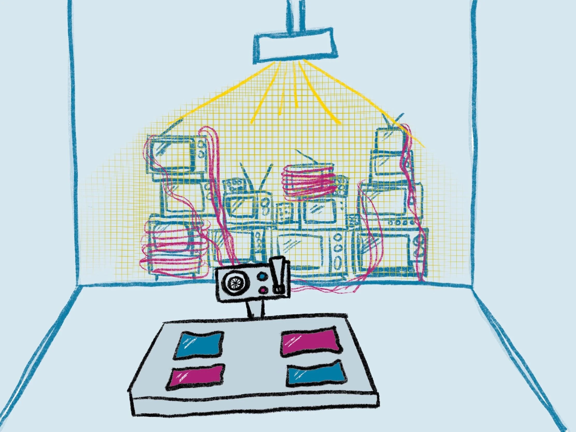
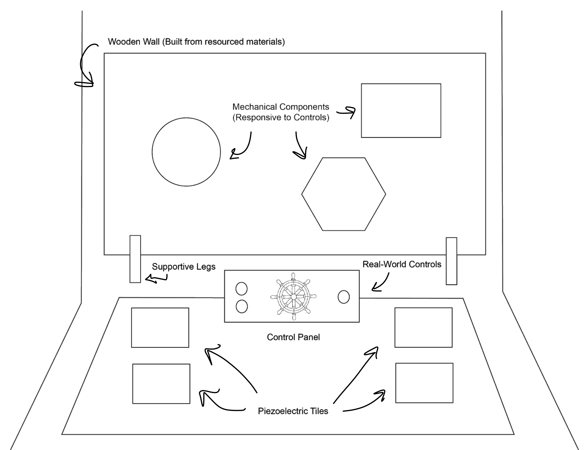
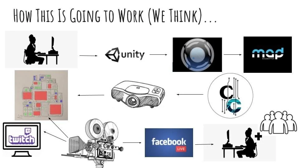
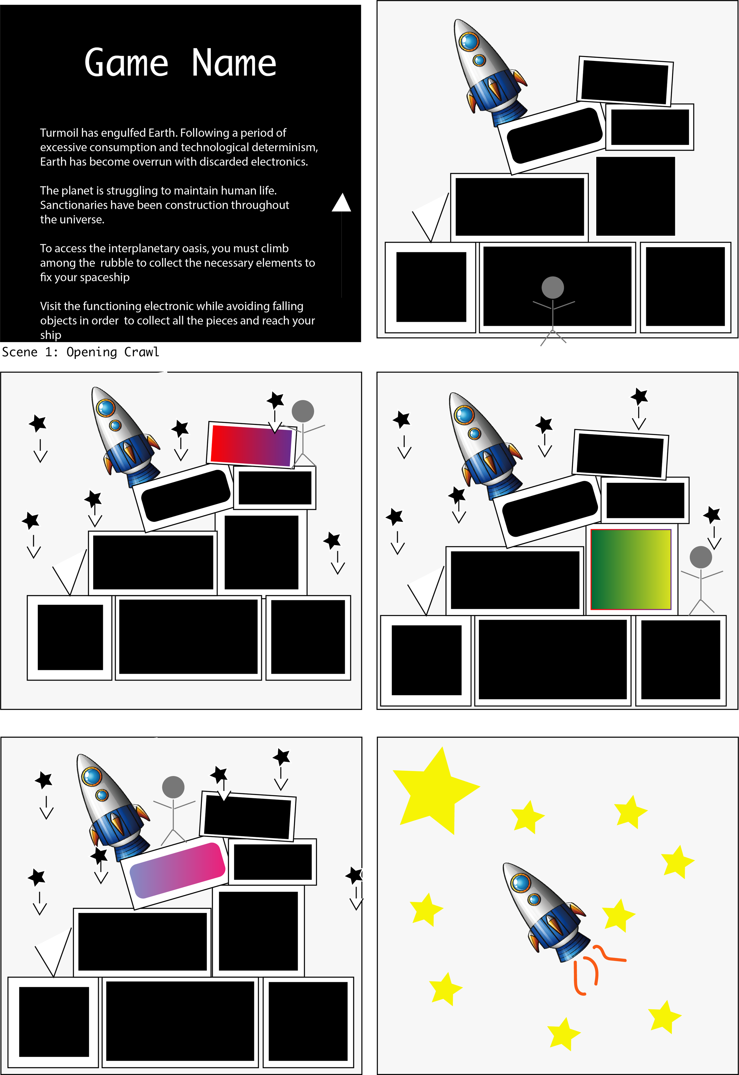
As the lead UX Designer for this project, my original plans were to use surveys as well as schematics and prototypes to implement generative and evaluative user testing. We used the following schematics and visuals to express to our potential viewers what our design would look like:
Top Row: a basic drawing for the installation layout, a more detailed schematic for the installation layout, plans for the wall of electronics
Bottom Row: the technology flow for the installation, a 3D rendering of the wheel control, a preliminary storyboard
I also conducted some surveys to gain an understanding of user engagement with our original design direction. These surveys were conducted after basic, working prototypes of our original design had been created and could be displayed to the class. However, when COVID-19 hit, we believed that we could still conduct a revised version of our original group project.
From these surveys and user testing of our early prototypes, I learned that our work was intriguing, but required a stronger sense of user feedback response. For example, when the user pressed a button or control, there needed to be an immediate light or sound alerting the user to the success of the mechanical interaction. I also learned that our overall concept and design was engaging and invoked feelings of nostalgia and connectedness. That was encouraging, as that was the original goal for the installation.
Although I did gain some responses and insight from these surveys, the data quickly became outdated as social distancing requirements increased. Our group could no longer meet in-person, nor create and conduct an interactive installation for the public. So, the insights gained from initial user testing had to be pivoted to fit a new project.
One aspect I could carry into the final project was the emotional engagement on the user end. Our users engaged with the more nostalgic and “retro” aspects of our original design. They also responded to immediate and obvious feedback and engaged with a deliberate emotional component that pushed for human-to-human contact.
schematic of final project layout
This, of course, was challenging to employ in a final project that existed only in my living room and online. However, I was able to incorporate immediate feedback by having the sculpture respond to the user’s approach. This provided the obvious response that alerted the viewer to a meaningful interaction with the installation.
User testing - as the user approaches, the sculpture interacts by lighting up with projection-mapped video
I also found that incorporating footage of human beings, along with the footage of empty streets and time-lapses of nature appealed more to my audience. While, originally, I had a lot more footage of me drawing, of nature, of more empty streets and human-less scenes, I found that my users didn’t engage as fully with this imagery. Therefore, I tried to include human faces, scenes of connection, and expressions of emotion as much as possible.
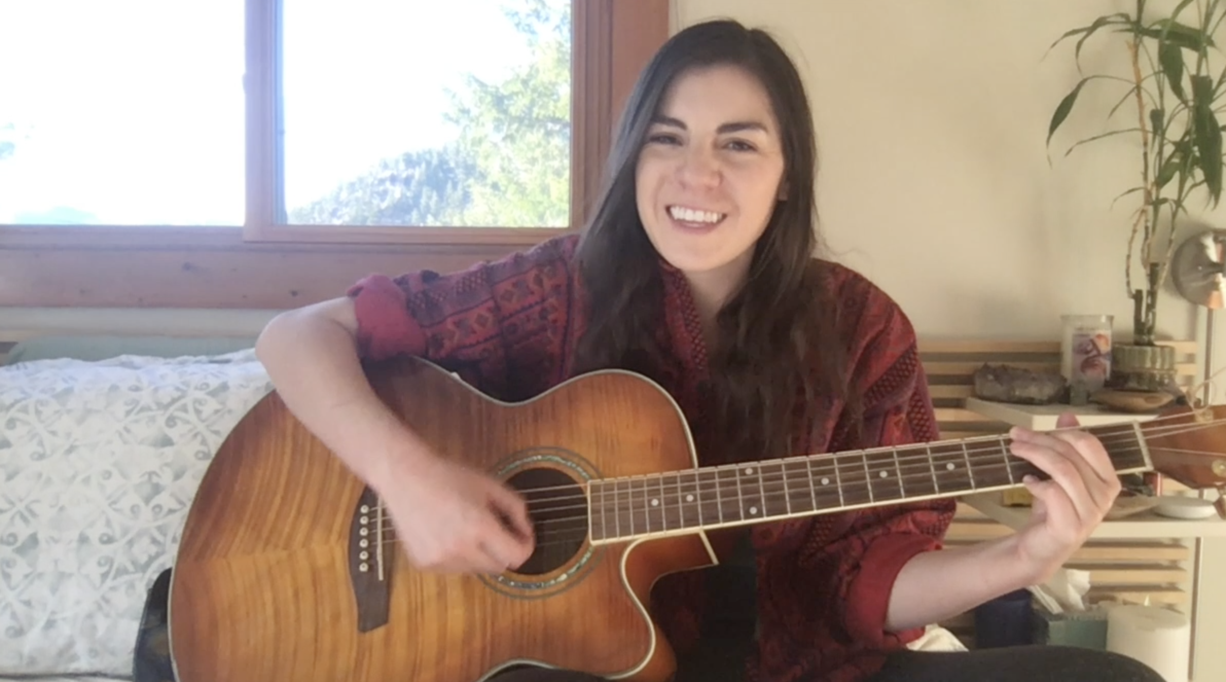
There is footage of people wearing masks around the world. There’s a clip of me smiling as I play guitar over Zoom with some friends during a virtual jam happy hour. There’s a clip of me virtually saying cheers with a friend as we discuss his upcoming graduation. There’s a clip of me crying with my mom.
These little snippets of human connection during this time resulted in an emotional connection with the user. As one user stated, “I appreciate the vulnerability you showed with this project and your experiences.”
“We’re all struggling right now, and sharing that vulnerability was both therapeutic and uplifting for me.”
With this project, I hoped to demonstrate both the ways in which we have been separated by this pandemic, and the ways in which, despite everything, we have come together.
prospective developments
My dream for this project is for it to be installed in a museum, whenever those are accessible again. As an artist, I want to allow for the reimagining of the museum-going experience for the world that we currently exist in. I think the typical museum-going experience will have to change for the foreseeable future and I believe this installation could exist in that safely socially-distanced world, as it’s only meant to be viewed by one user at a time.
For a fully-developed exhibit, I would need to fully implement the use of a proximity sensor and code its read inputs to change the video being projection-mapped. I would also want to scale up the size of the project. I was working with one can of white spraypaint (bought before quarantine) and found objects from around my house. For a full-scale installation, I would want to incorporate objects from other people and make the sculpture larger. I would also need a ceiling-mounted projector. Other than those simple changes, this project could easily be implemented into a studio space.
In the meantime, I can share the sculpture and projections in my living room through the internet, and keep hoping that my work somehow inspires some hope in others during this crisis.

